Designing a mobile solution for the Student Enrollment platform
A UI/UX Case study on building a mobile solution for students applying for higher education.
To comply with my non-disclosure agreement, I have omitted and obfuscated confidential information in this case study. All information and content are my own and do not necessarily reflect the views of Proodle Solutions.
About Proodle?
Proodle Solutions is a startup initiative by a group of individuals based in Nottingham, with a vision of building innovative demand generation, engagement and conversion platform for education providers to boost operational efficiency from interest to international students' enrolment.
Their platform offers a unique experience for both institutions and students to have greater transparency and control over their decision-making process.

Picture of Proodle winning The Ingenuity Award for 2019.
Design Challenges
Building a mobile solution for students opting for higher education. They need a guide to help them in their overall journey and also keep them informed about updates during the process. A platform where they can look for preferred courses, check their eligibility criteria, apply for admissions, easily manage dates or tasks, and can contact college easily for updates or queries. ( This will be a SaaS-based product for both Android and iOS platforms )
My Role
I worked as a UX consultant for creating an MVP — Minimum Viable Product. I collaborated with the team remotely and shared all the updates through Skype, Slack, and emails. I worked closely with the Product Manager, Lead Marketing Executive, Founder, and a small Development team, along with a UX intern.
-
Requirement gathering and looking into the basic feature requirements for the application.
-
Guiding a team with Research and Interviews.
-
User experience and interface design.
-
Wireframing, Prototyping, and final Visual Design.
-
Motion & Interactions.
-
Collaboration with the development team.
My Design Process
I followed the Double Diamond Design approach for this project. The Double Diamond is a structured design approach to tackle challenges in four phases:
-
Discover /Research — insight into the problem (diverging)
-
Define/Synthesis — the area to focus upon (converging)
-
Develop/ Ideation — potential solutions (diverging)
-
Deliver /Implementation — solutions that work (converging)

DISCOVER
Understanding the problem better
I started with the design brief shared by them. I highlighted each touchpoint and featured mentioned in the brief and made notes. I started with Why, When, Who, Where, When and How questions to gain better empathy for the given problem. I had constant discussions with the clients and tried to cluster my findings into topics and areas of interest that we could start with.
Research Objectives
-
What are the problems faced by students when they look for opportunities for higher education?
-
What are their decision points or information criteria while selecting a course or college? (college, courses, accommodation, part-time jobs, country-specific requirements, fees, and scholarships, etc)
-
Why do 60% of prospective students dropoff during the final admission stages? ( Are they satisfied with the information and facilities provided by the local recruitment personnel /regional offices)
-
How can we create a better communication platform for connecting students to the university and vice versa? (AI based assistant, admission counselor, teacher, etc)
Interviews
We planned with our team and conducted two separate interview sessions, some were video calls and some were done face-to-face. We conducted semi-structured interviews with 10 students and video calls with 6 students for qualitative information.

Surveys
We took this approach to reach a larger group of students when they were in the comfort zone. We took surveys with over 43 students through the medium of Survey Monkey, and Google Forms for our quantitative information.

Secondary Research & Competitive Benchmarking
We conducted our secondary research online and gathered articles and reading materials on annual admission surveys, patterns and trends of UK higher education, students intake on Higher Education, marketing insights on foreign students, and UCAS timeline and process.
We did some competitive benchmarking on some of the mobile applications that are working on the same model or were closely related to college education and admissions like My Nottingham, MyuON, iLancaster, Ulster Uni Campus Connect, and Whatuni.

Key Findings from the Research
-
Students (over 60%) consider Course as the most vital parameter while looking for admissions. They prefer selecting courses over the selection of college accommodation or any other amenities.
-
Students look for quick filtering of results for the eligibility of their preferred courses. What are the minimum requirements for the application?
-
Students (over 30%) from other countries preferred to have upfront information about the admission criteria and college information related to their country. This is mostly hidden or not easily discoverable in most of the college websites.
-
Students (over 50%) needed to know what are the other amenities and facilities provided by the college and what is the college education rating?
-
Students (over 30%) wanted to interact with college students and staff personally or through any digital medium. Students seek a chat or forum section where they can ask questions and clarify their doubts.
-
Students (over 80%) needed a step-by-step guide to keep track of the important dates and events while taking admission and even after admission.
DEFINE
Affinity Mapping
All the data collected were organized to understand and identify some of the common patterns in the users and their behavior through the Affinity Diagram. This helped us to further understand the pain-points, goals, aspirations, motivations, and needs of the users.
Archetypes and Personas
Based on our initial research I came up with 2 Archetypes; Strivers & Strugglers and Explorers & Highfliers. These archetypes were used to create two distinct user personas for our product.
-
Strivers & Strugglers: I plan to study in a top tier UK college and need to select the best college scholarships and financial aid opportunities.
-
Explorers & Highfliers: I want to join a prestigious college for my personal growth and want to explore new experiences.
User Journey Mapping
User journey mapping helped me understand further :
-
Motivation. Why are they trying to do it?
-
Channels. Where interaction takes place
-
Actions. The actual behaviors and steps that were taken by users.
-
Pain points. What are the challenges users are facing?
This helped me to map the process and find opportunity areas that we could further ideate on.

DEVELOP
Ideation/ Barainstorming
Based on the opportunity areas we identified earlier we did brainstorming and diverged further. To keep the brainstorming more in line to our requirements we divided the whole student journey into three stages and looked for opportunity areas :
-
Pre-Application (Stage before the student has initiated the application process) This stage emphasized more on the discovery, comparing, selecting, exploring, and deciding of course or college.
-
Application (Student has applied for admissions and in the process of enrollment) This stage emphasized the process of application, collecting and submitting documents, managing dates and planning in advance.
-
Post-Application (After completing all the process of application and preparing for college) This stage emphasizes on the process where the student has completed all the enrollment requirements and has wait for the course to get started.

MVP - Feature Listing
We then identified the following feature which could be used to make the experience of the application more pleasurable for the users. Taking the initial brainstorming and user journey map as a starting point, we mapped out these features in line with the overall user journey.

DELIVER
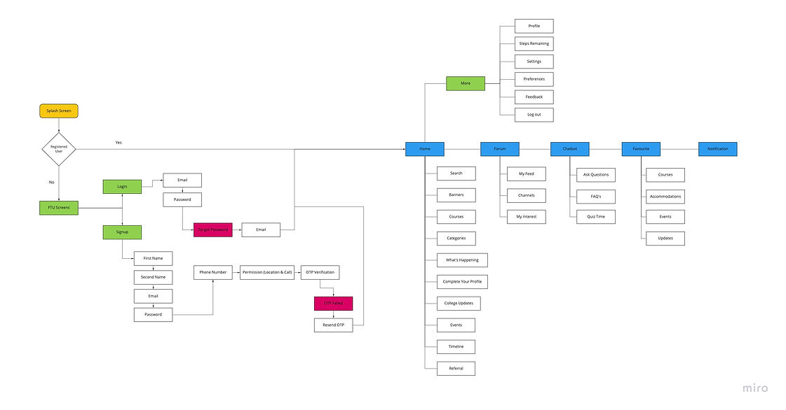
User flow
Once all the features and functionality were finalized, started structuring the flow of the application. User Flow was done at this stage to define and structure out all the new and existing features of the application.

Wire-frames and Sketches
We then started with a pen and paper to give our thoughts and ideas shape. We looked around our opportunity areas to come up with smart and quick ideas. We later converted these paper wireframes into quick low-fidelity wireframes.


Final Visuals


